Visual Studio configuration tips

This post describes how I have configured Visual Studio (2017 is the current version) to look and behave the way I want it to. Writing it down makes it easier for me to repeat the setup the next time I install Visual Studio on a new computer, but maybe someone else will find it useful as well.

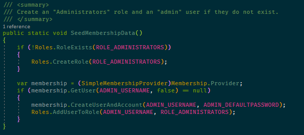
This is how a fragment of C# looks in my Visual Studio:

Color Theme

For years I have been using a color theme called Solarized Dark, of which there are many versions on the web and for many editors. I have modified a few colors but I think (but am not sure anymore) that the version I started with is this one: https://studiostyl.es/schemes/solarized-dark

I have exported my Fonts and Colors setting in Visual Studio to make them easy to reinstall, and this also includes the customized ReSharper colors (see below). Download here and use the Tools/Import and Export Settings… option in Visual Studio.

Font

The font I use is called Fira Code and supports programming ligatures which means that some combinations of characters are shown as custom symbols, such as in the lamba expression in this code fragment:

Fira Code can be downloaded directly from its GitHub repository: https://github.com/tonsky/FiraCode

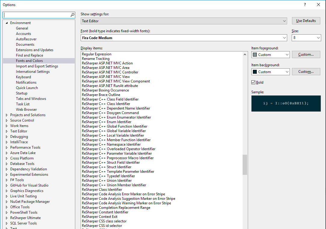
Install it into Windows by downloading the contents of the distr/ttf folder and install the different variants of the font by right-clicking on them in the File Explorer and select Install in the context menu. Then go to Visual Studio’s Tools/Options menu option, to Environment/Fonts and Colors and select the font you want. I use the Fira Code Medium variant as it looked the best on my monitor.

Visual Studio Extensions

Setting the color theme and the font is still not enough to get the Visual Studio look the way I want. To go the whole way I also need two Visual Studio extensions: ReSharper and Viasfora.

ReSharper

If you’re using Visual Studio for any serious work, chances are you’re already using ReSharper because of its very powerful coding tools such as the code suggestions and refactoring features. It also extends Visual Studio’s syntax highlighting with many more coloring rules. This can be seen in the Fonts and Colors dialog where these colors can be customized:

However, the coloring rules are not used unless ReSharper’s syntax coloring is enabled, as it’s disabled by default. The reason for this is probably that it does affect editing performance a little but if you have a powerful machine I think it’s worth enabling them. Not doing this leaves you with something like this:

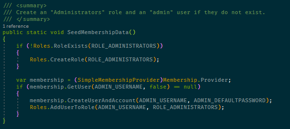
Compared to the example at the beginning of this post there are differences in that constants and methods are not colored, which I think they should be.

To enable the feature, go to ReSharper options and find the Code Inspection/Settings page and enable Color identifiers:

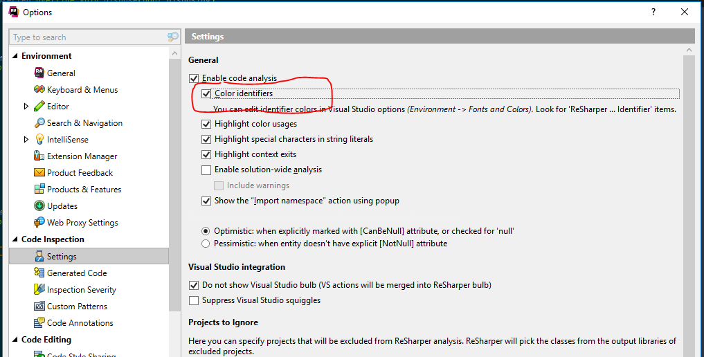
Since you’re already in ReSharper settings, you might also find it useful to enable the Use CamelHumps setting in Environment/Editor/Editor behavior. This is a feature which changes the definition of word delimiters when editing so that when moving the cursor to the next or previous word (Ctrl + Right/Left Arrow), it stops at upper case characters in camel cased symbols. Very useful for moving into long symbol names if you need to change something in the middle of them.

Viasfora

Viasfora is a fairly recent acquaintance of mine and I have found it useful to add the final coloring behaviors I want:

  • Rainbow parenthesis
    I didn’t know I needed it before I saw it, but now I find it very useful to have parenthesis and bracket pairs to have matching colors which are different from the colors of nested parentheses. Makes it much easier to see parenthesis mistakes when writing code. Visasfora has this feature and the colors it uses are customizable too.
  • Customizable colors for some keywords
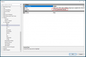
    It has for quite some time disturbed me that all visibility keywords in C# are colored the same. I really need private and public to be colored differently to make it easier to see the exposed surface of a class. Viasfora doesn’t exactly have this feature, but it does its own keyword coloring which will override Visual Studio’s built-in coloring. And its list of keywords is editable, so I can for example remove all keywords that I don’t want Viasfora to color and then set the color it uses to a discrete gray:

    This is the result and as you can see, it’s very easy to see the difference between public and private members:
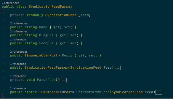
Final comments

A lot of the above has to do with aesthetics but I don’t think it’s only about making the editing experience “look good”, which anyway is rather subjective. I firmly believe in minimizing the mental energy spent on interpreting and understanding code so that more energy can be put into solving the actual problems. With the changes above, I don’t have too look up symbols to see if they’re constants or enums or variables and it’s easy to see what methods are public. I think this makes me a little bit faster and my code a little bit better. That it’s nicer to look at the code is a bonus 🙂

Good luck with fiddling with configuration on your own, and feel free to post suggestions in the comments. Improving the development experience is a task I never expect to finish so new ideas are always welcome!

/Emil

NDepend v6

I have written about NDepend a few times before and now that version 6 has been released this summer it’s time to mention it again, as I was given a licence for testing it by the kind NDepend guys 🙂

Trend monitoring

The latest version I have been using prior to version 6 is version 4, so my favorite new feature is the trend monitoring functionality (which was actually introduced in version 5). Such a great idea to integrate it into the client tool for experimenting! Normally you would define different metrics and let the build server store the history but having the possibility of working with this right inside of Visual Studio makes it so much easier to experiment with metrics without having to configure this in the build server.

Here is a screen shot of what it may look like (the project name is blurred so to not reveal the customer):

Dashboard with metrics and deltas compared to a given baseline plus two trend charts

Dashboard with metrics and deltas compared to a given baseline plus two trend charts

  • At the top of the dashboard there is information about the NDepend project that has been analyzed and the baseline analysis used for comparison.
  • Below this there are several different groups with metrics and deltas, e.g. # Lines of Code (apparently the code base has grown with 1.12%, or 255 lines, in this case when compared to the baseline).
  • Next to the numeric metrics are the trend charts, in my case just two of them, showing the number of lines of code and critical rule violations, respectively. Many more are available and it’s easy to create your own charts with custom metrics. BTW, “critical” refers to the rules deemed critical in this project. These rules will differ from project to project.
    • In the image we can see that the number of lines of code grows steadily which is to be expected in a project which is actively developed.
    • The number of critical errors also grows steadily which probably indicates an insufficient focus on code quality.
    • There is a sudden decrease in rule violations in the beginning of July where one of the developers of the project decided to refactor some “smelly” code.

This is just a simple example but I’m really liking how easy it now is to get a feeling for the code trends of a project with just a glance on the dashboard every now and then.

The Dependency Matrix

The trend monitoring features may be very useful but the trademark feature of NDepend is probably the dependency matrix. Most people who have started up NDepend has probably seen the following rather bewildering matrix:

The dependency matrix can be used to discover all sorts of structual propertis of the code base

The dependency matrix can be used to discover all sorts of structual propertis of the code base

I must confess that I haven’t really spent too much time with this view before since I’ve had some problems grasping it fully, but this time around I decided it was time to dive into it a little more. I think it might be appropriate to write a few words on my findings, so here we go.

Since it’s a little difficult to see what’s going on with a non-trivial code base, I started with something trivial, with code in a main namespace referencing code in NamespaceA that in turn references code in NamespaceB. If the view does not show my namespaces (which is what I normally want, then the first thing to do when opening the matrix is to set the most suitable row/column filter with the dropdown):

The dependency matrix filtering dropdown

I tend to use View Application Namespaces Only most of the time since this filters out all third party namespaces and also expands all my application namespaces (the top level of the row/column headers are assemblies which is not normally what I want).

Also note that the calculation of the number shown inside a dependency cell can be changed independently of the filtering. In my case it’s 0 on all cells which seems strange since there are in fact dependencies, but the reason for this is that it shows the number of members used in the target namespace and in this case I only refer to types. Changing this is done in another dropdown in the matrix window.

Another thing I learned recently is that it may be very useful to switch back and forth between the Dependency Matrix and the Dependency Graph and in the image below I show both windows next to each other. In this simple case they show the same thing but when the code base grows then dependencies become too numerous to be shown visually in a useful way. Luckily there are options in the matrix to show parts of it the graph, and vice versa. For example, right clicking on namespace row heading opens a menu with a View Internal Dependencies On Graph option so that only a subset of the code base dependencies are shown. Very useful indeed.

Here’s what it may look like:

A simple sample project with just three namespaces

A simple sample project with just three namespaces

Also note that hovering over a dependency cell displays useful popups and changes the cursor into an arrow indicating the direction of the dependency, which is also reflected by the color of the cell (by the way, look out for black cells, they indicate circular references!)

Another way to invoke the graph is to right click a dependency cell in the matrix:

Context menu for a dependency


The top option, Build a Graph made of Code Elements involved in this dependency does just what is says. Also very useful.

By using the expand/collapse functionality of the dependency matrix together with the option to display dependencies in the graph view it becomes easier to pinpoint structual problems in the code base. It takes a bit of practise because of the sheer amount of information in the matrix but I’m growing into liking it more and more. I would suggest anyone interested to spend some time on this view and it’s many options. I found this official description to be useful for a newcomer: Dependency Structure Matrix

Wrapping it up

NDepend 6 has many more features than what I have described here and it’s such a useful tool that I would suggest anyone interested in code quality to download a trial and play around with it. Just be prepared to invest some time into learning the tool to get the most out of it.

A very good way to get started is the Pluralsight course by Eric Dietrich. It describes NDepend version 5 but all of it applies to version 6 as well and it covers the basics of the tool very well. Well worth a look if you’re a Pluralsight subscriber.

NDepend – first impressions

nDI was recently contacted by Patrick Smacchia, one of the developers behind NDepend and he asked me if I’d like to try it out, which I did. This is a report of my first impressions.

If you’re not familiar with NDepend, it can be described as a tool to analyze a set of .Net assemblies for code quality. I suppose its name indicates that it originally was focused on analyzing dependencies but these days that name is rather misleading, in my opinion, as it can do much more that that. I’ll go through some of its capabilities below.

When you first analyze a set of assemblies, NDepend displays a screen similar to this:

NDepend main screen

If you’re like me, then you didn’t check out any tutorials or web casts before running the tool and your first reaction is likely “Holy cow! What’s all this?” or something similar. 🙂

It turns out that there is a ton of useful information in these displays but you have to know how to interpret them which takes a little learning.

Briefly, here’s what I gathered so far:

  • The Metrics display (with the gray blobs) lets you select a metric (such as the number of lines of code) and display it on the selected code level (method, field, type, namespace or assembly). The the blobs represent code entities of the given level and their sizes correspond to the metric’s value. All children blobs of the parent level are grouped together to indicate which parents have high accumulated values of the metric. This display was really bewildering to me at first but once you decode its structure then it’s really powerful.
  • The Dependency graph is more intuitive and let’s you see call dependencies between code components of different levels. Works well on small numbers of components but once you start to display larger dependency chanins, e.g. between methods, then it quickly becomes very difficult to use.
  • The Dependency matrix is also fairly unintuitive at first, but very powerful.
    NDepend depenency matrix
    It contains the so called Dependency Structure Matrix with displays dependencies between code elements. Each non-empty cell in the matrix represents a dependency but the number can have different meaning depending on user selections in the GUI. Green and blue cells indicate one-way dependencies (hover mouse over a cell to display a small arrow indicating the direction) while black cells represent bidirectional dependencies, which might be a cause for concern. This display can really show many interesting aspects of usage dependencies and it can also be used to generate dependency graphs for subsets of these dependencies (try the popup menu to see what I mean).
  • Finally, there the CQL query display where you can use the NDepend Code Query Language to further analyze your code. By default a set of standard queries are executed, listing potentional problems with naming, performance, and many others.

In addition to the displays described above, an HTML report is also generated after analyzing assemblies. It displays much of the same information as the graphical and interactive displays above, but also contains the “Abstract vs instability diagram”:

NDepend AbstractnessVSInstability diagram

Obviously you want to be in the green area with all your assemblies, but the dimensions used might not be completely clear at first sight. This seems to be a good article describing it it detail.

So, what are my first impressions? Well, I must say that NDepend really is a very powerful tool for analyzing code but it does require investing some time to use its many features properly. To me, that seems like an investment well worth doing.

/Emil